
Finally, you want to know about Flexbox, The CSS3 flexbox is used to make the elements behave predictably when used with different screen sizes and display devices. It provides a more efficient way to layout, align and distribute space among items in the container. we apply flex property to containers and flex items.
for flex parent Element (Container)
display: flex | inline-flex;
flex-direction: row | row-reverse | column | column-reverse;
flex-wrap: nowrap | wrap | wrap-reverse;
flex-flow: <‘flex-direction’> || <‘flex-wrap’>
justify-content: flex-start | flex-end | center | space-between | space-around;
align-items: flex-start | flex-end | center | baseline | stretch;
align-content: flex-start | flex-end | center | space-between | space-around | stretch;
for flex property applied to items/elements in a container
order: <integer>;
flex-grow: <number>; /* default 0 */
flex-shrink: <number>; /* default 1 */
flex-basis: <length> | auto; /* default auto */
flex: none | [ <'flex-grow'> <'flex-shrink'>? || <'flex-basis'> ]
align-self: auto | flex-start | flex-end | center | baseline | stretch;
/* without any flexbox property */

.container {

}
output -:
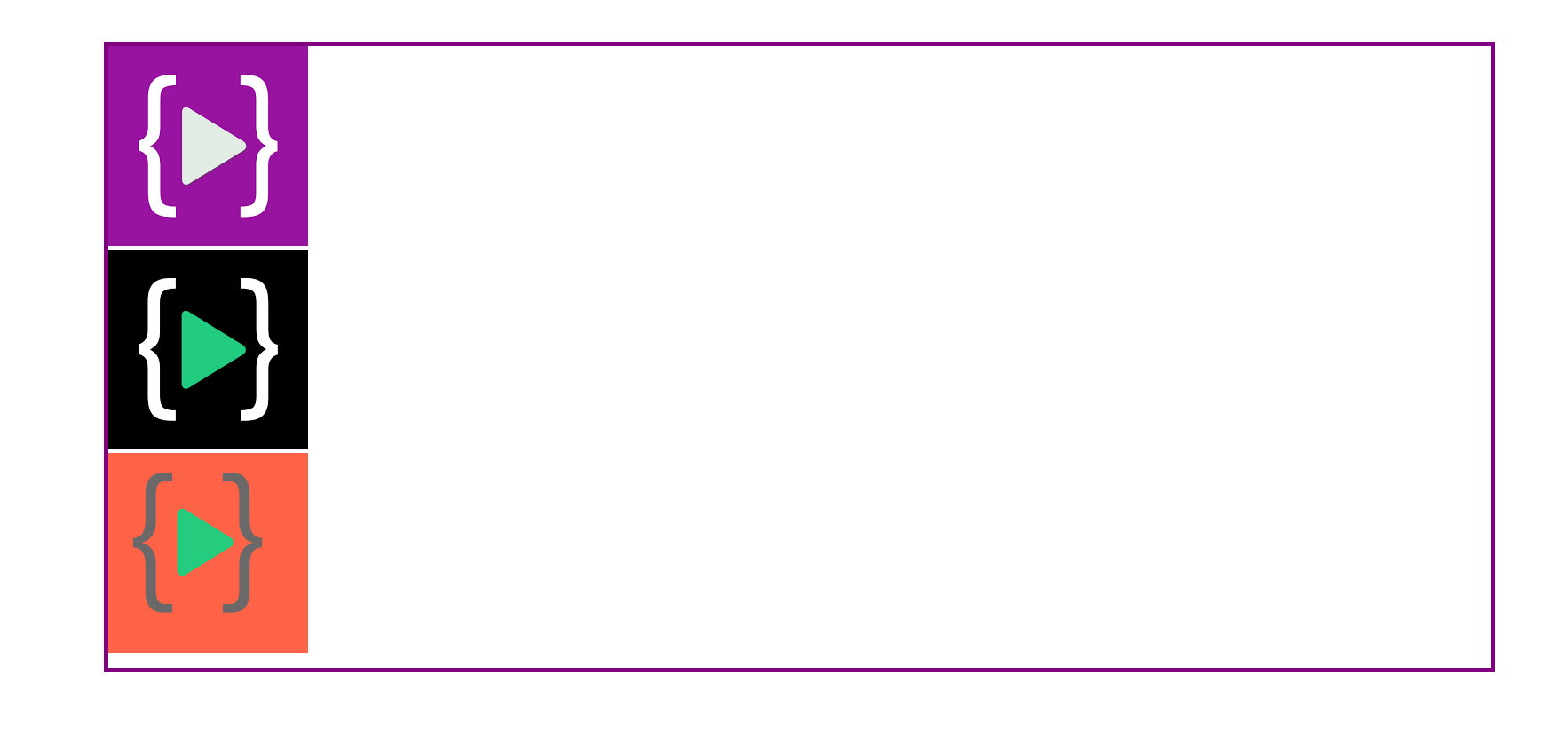
Each div has defaulted to display: block. Each square thus takes up the entire width of its line.
Now we will learn some important flex container properties but before we need to understand, a Flexbox container has two axes: a main axis and a cross axis, which default to looking like this:
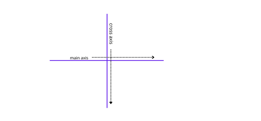
In order to get started with Flexbox, you need to make your container into a flex container. Now we will learn some important flexbox container properties and how to center items
Flex property
What is the default direction in the Flex container - Items display in a row (the flex-direction property's default is a row ). The items start from the start edge of the main axis. The items do not stretch on the main dimension but can shrink
.container {
    display: flex;
}
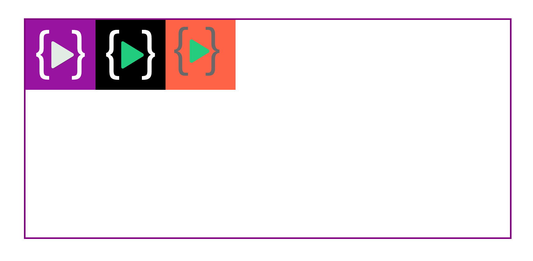
Flex-direction property
.container {

    display: flex;
    flex-direction: row;

}
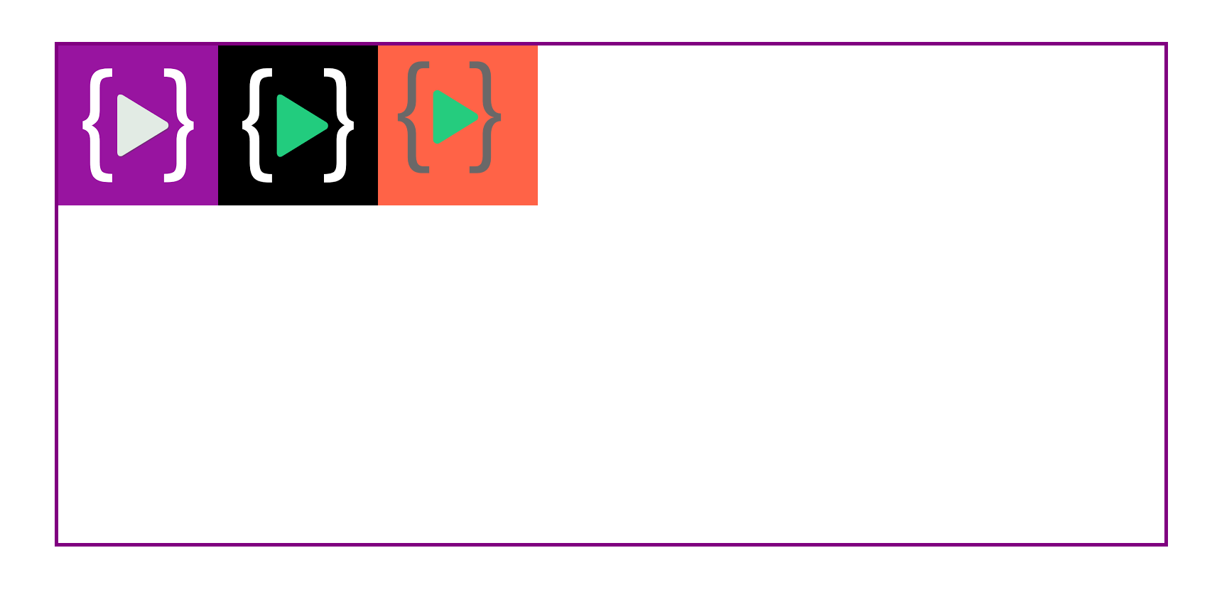
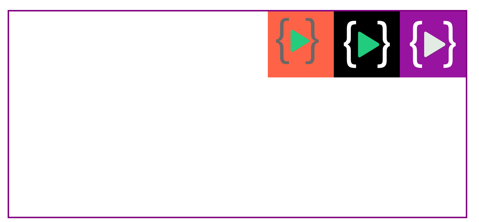
.container {

    display: flex;
    flex-direction: row-reverse;

}
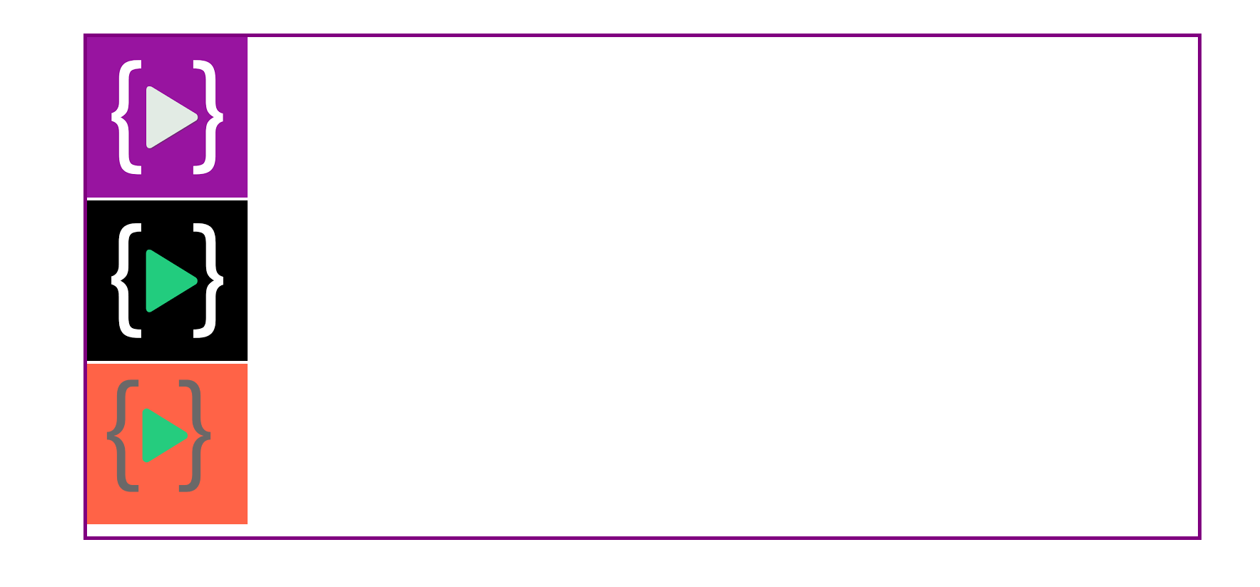
.container {

    display: flex;
    flex-direction: column;

}
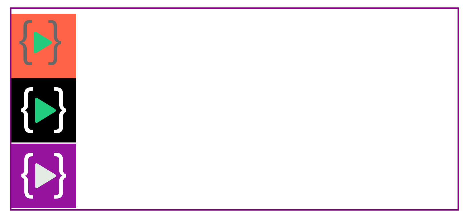
.container {

    display: flex;
    flex-direction: column-reverse;

}
Justify-content
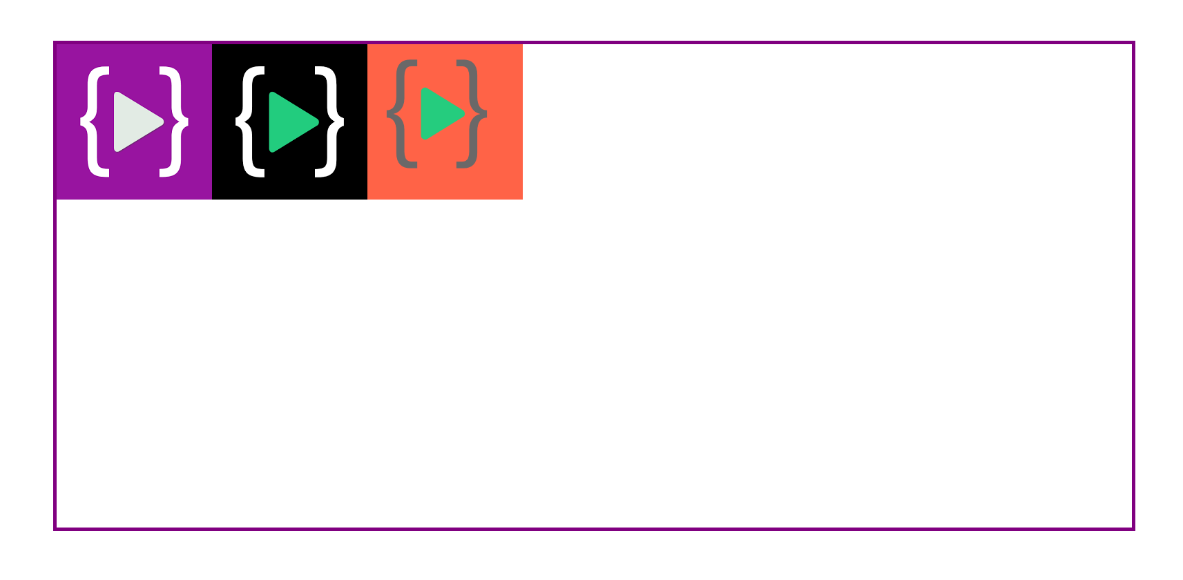
Justify-content arranged items on the main axis.
justify-content:flex-start;
.container {

    display: flex;
    justify-content:flex-start;
}
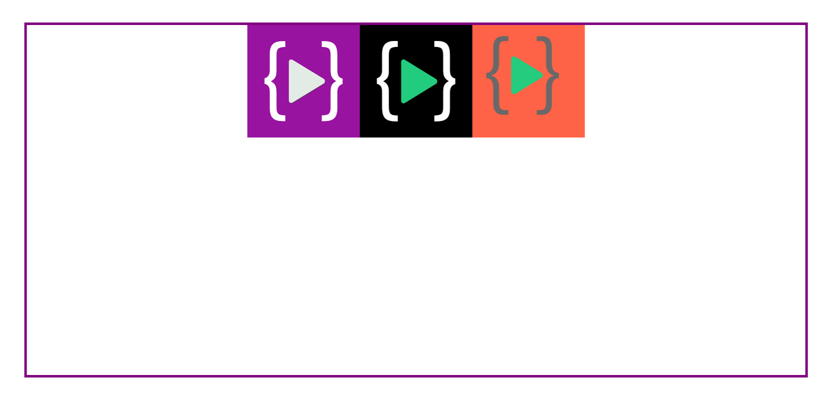
justify-content:center
.container {

    display: flex;
    flex-direction:row;
     justify-content:center;
}
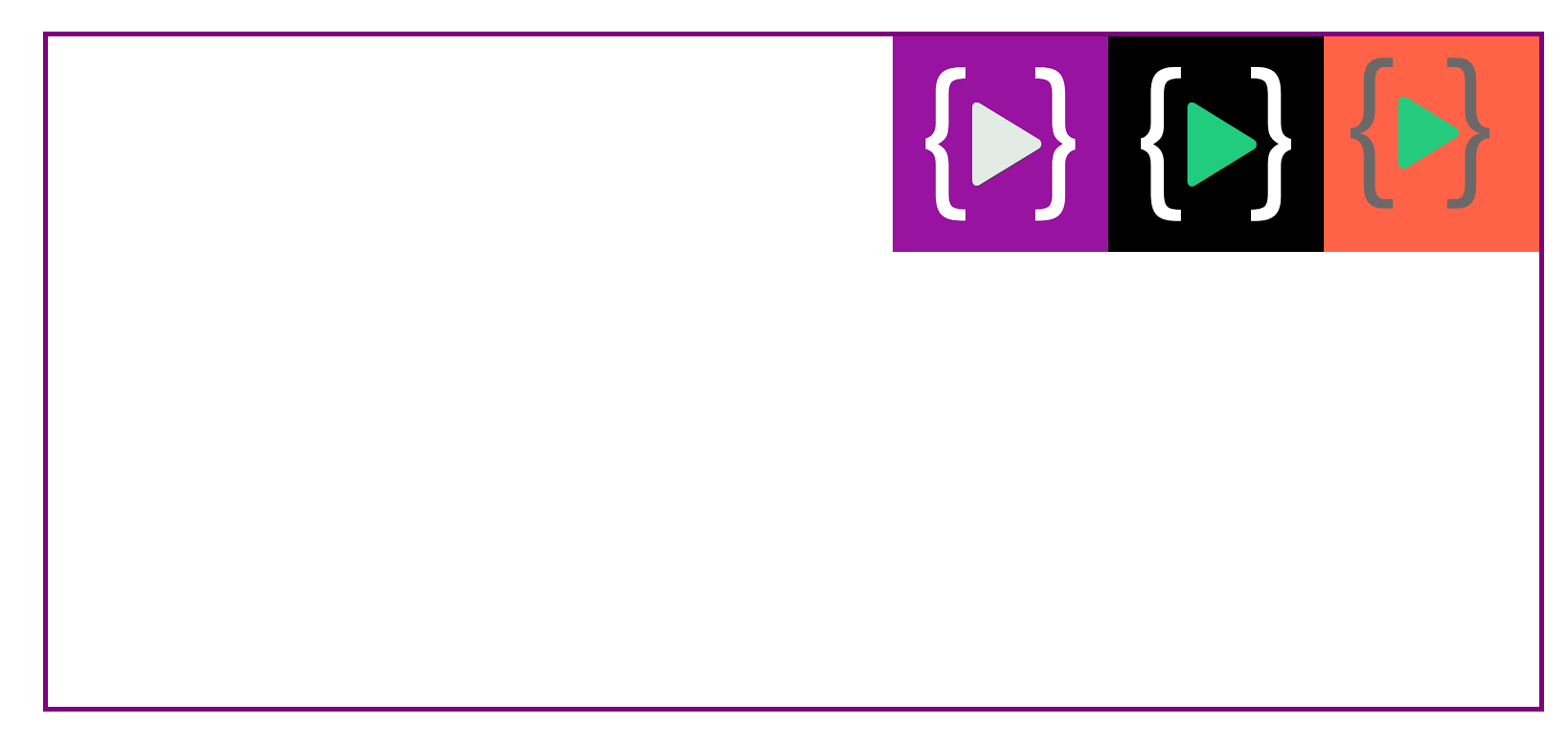
justify-content:flex-end
.container {

    display: flex;
    flex-direction: row;
    justify-content:flex-end;
}
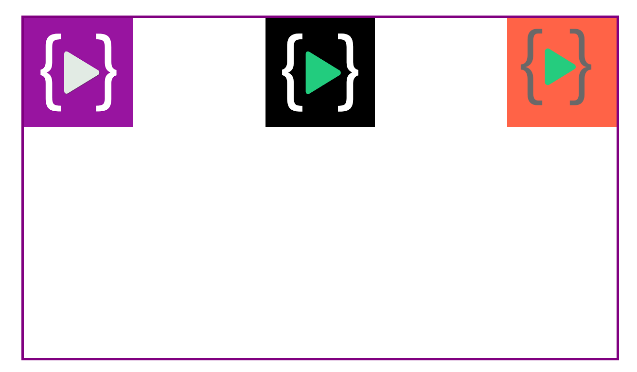
justify-content: space-between
.container {

display: flex;
flex-direction: row;
justify-content: space-between;

}
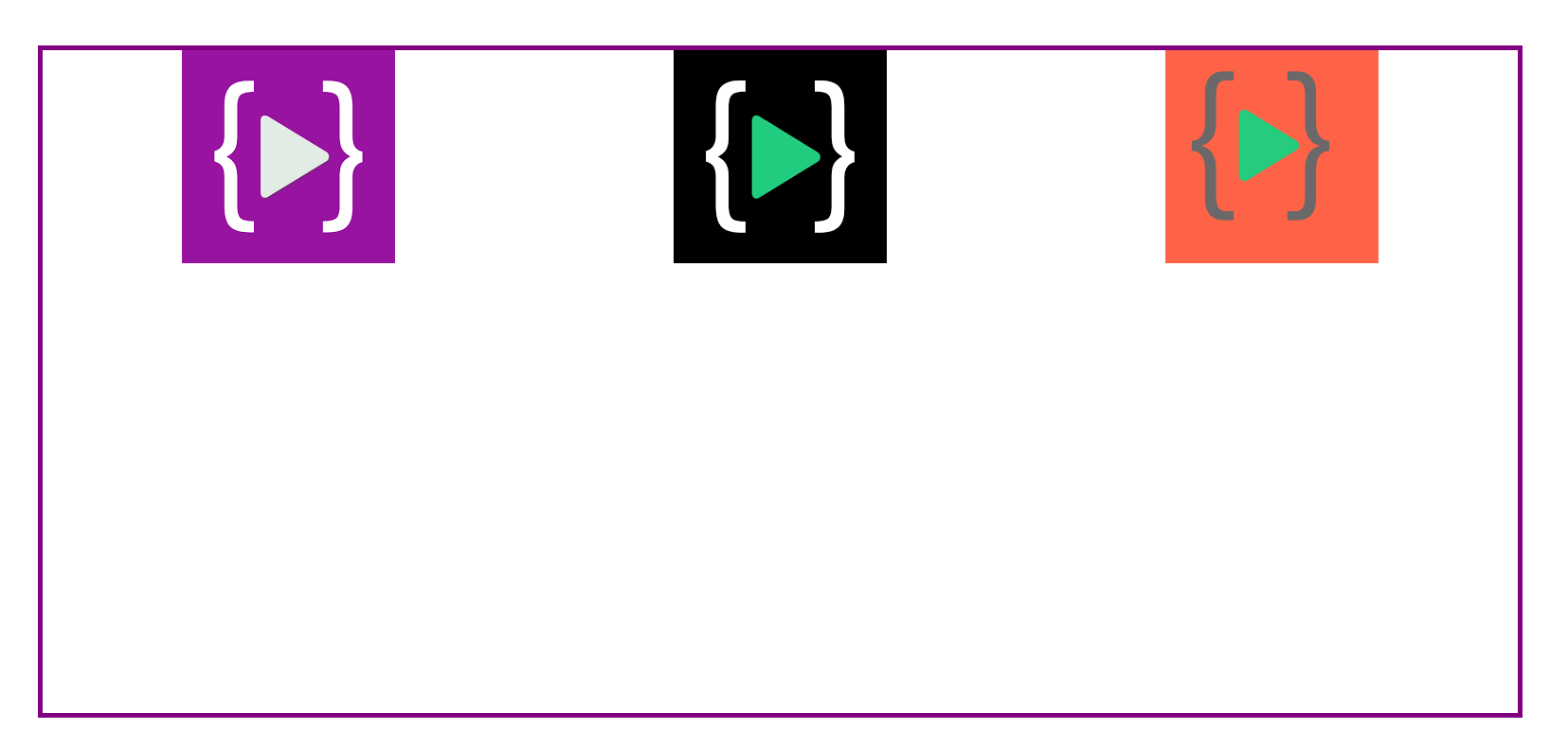
space-around
.container {

display: flex;
flex-direction: row;
justify-content:space-around;

}
space-evenly
.container {

display: flex;
flex-direction: row;
justify-content:space-evenly;

}
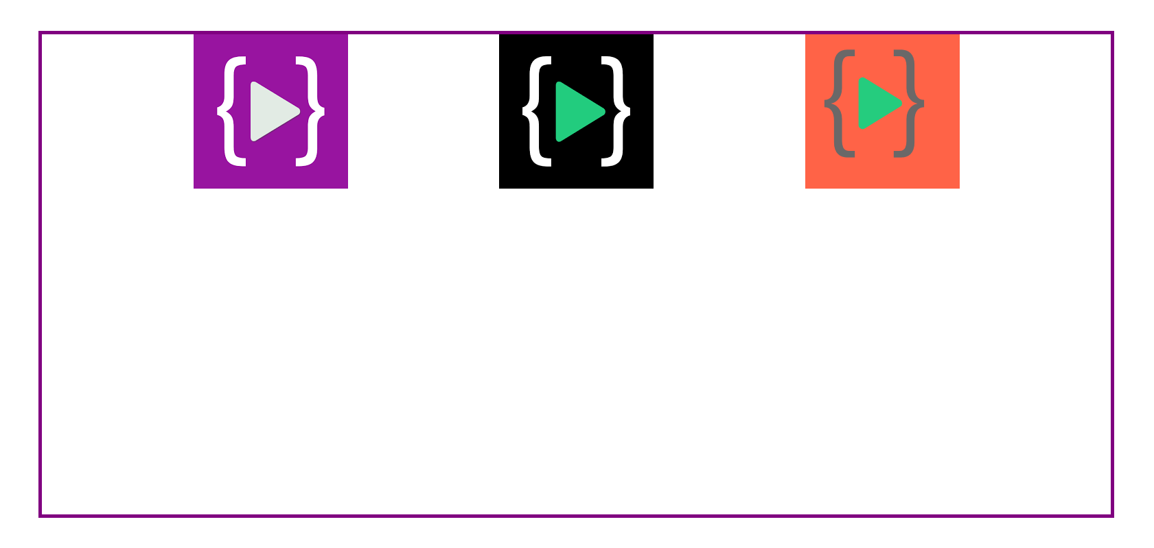
align-items
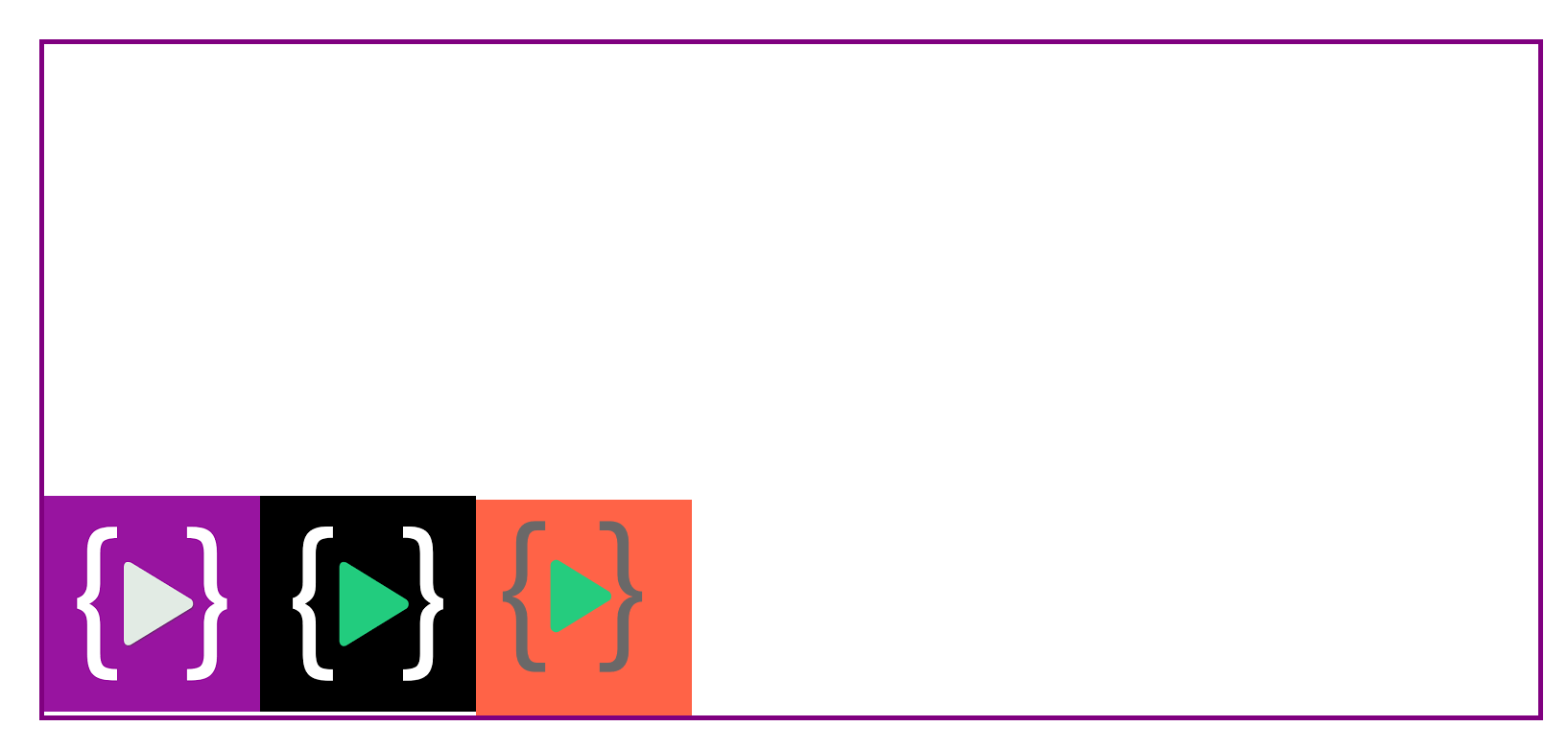
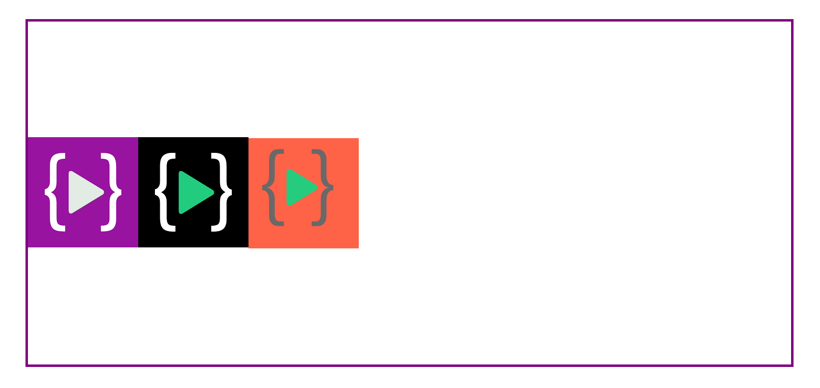
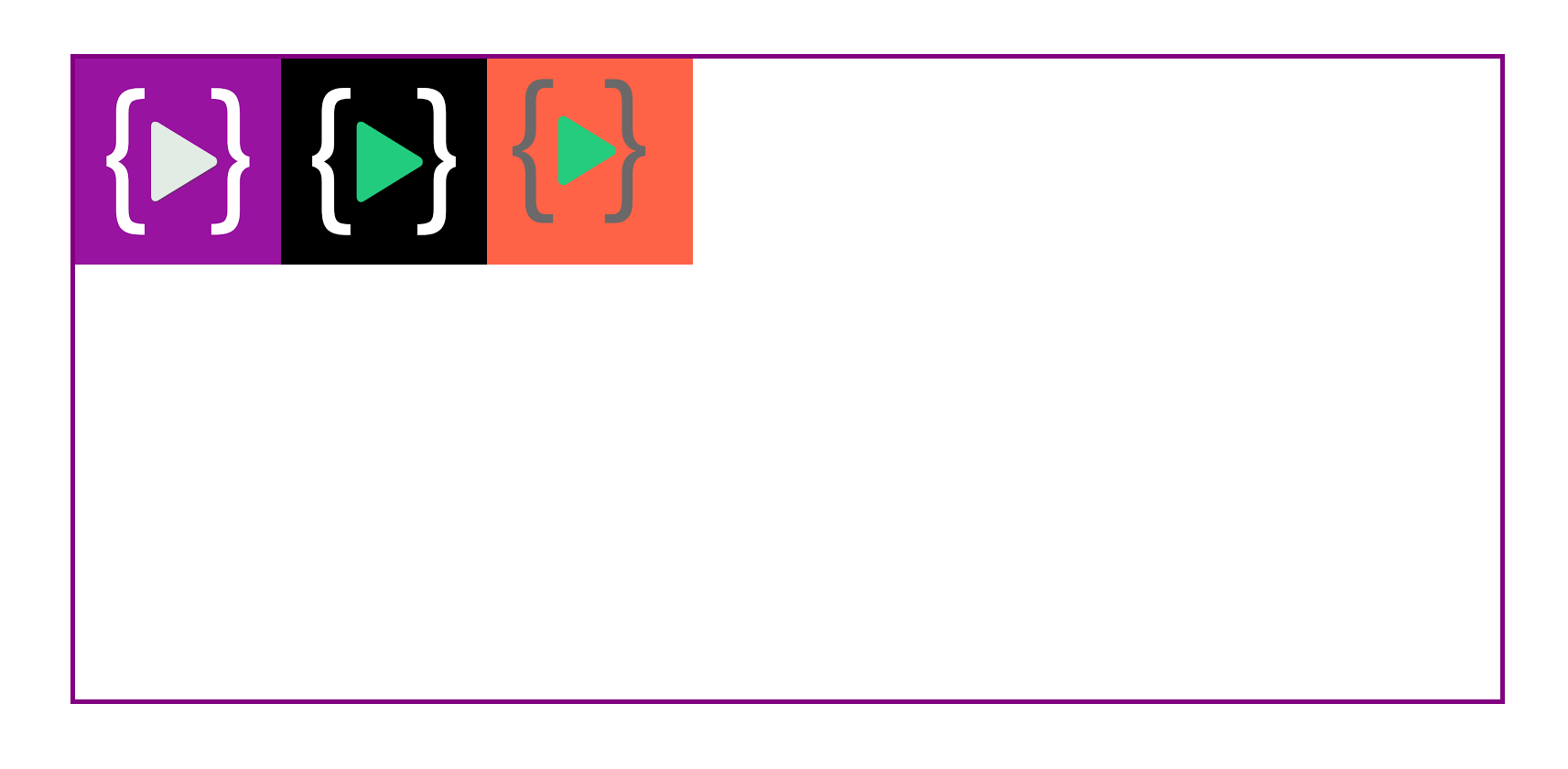
In align-items arranged items on the cross-axis. The first three are exactly the same as justify-content, so nothing too fancy here. As justify-content works along the main axis, align-items apply to the cross-axis.
.container {

    display: flex;
    flex-direction: row;
    align-items:flex-end;
}
.container {

    display: flex;
    flex-direction: row;
    align-items:center;
}
.container {

    display: flex;
    flex-direction: row;
    align-items:flex-start;
}
Now time to what the difference between align-items and justify-content, as we know in the justify-content property items are arranged on the main axis (It depends on which flex-direction of the container ) on the other hand align-items arranged items on the cross axis ( again it depends on container direction).
Now we will learn how to center all items with the help of flexbox.
.container {

display: flex;
flex-direction:row;
justify-content:center;
align-items:center;

}
On direction row
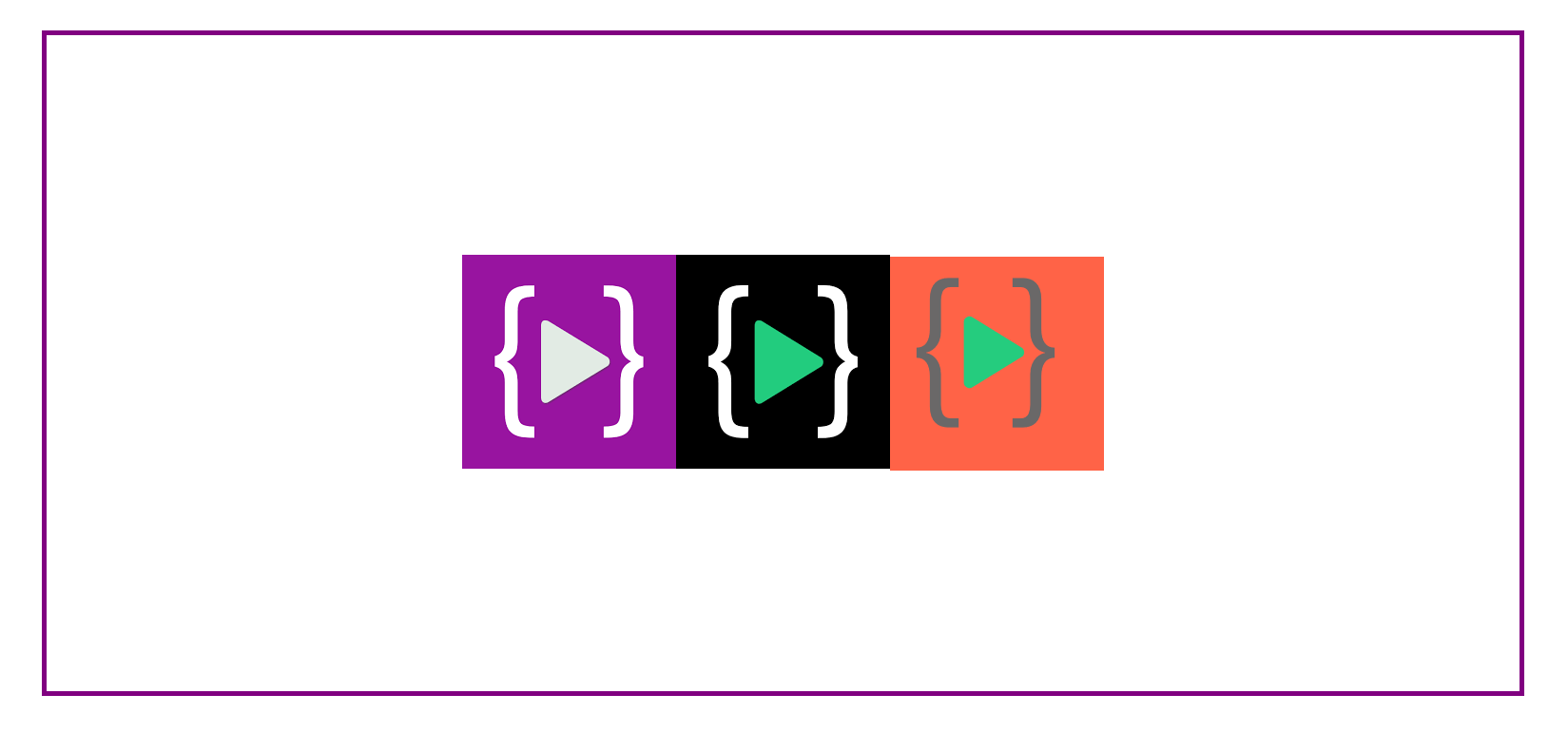
.container {

    display: flex;
    flex-direction:column;
    justify-content:center;
    align-items:center;

    }
on direction column
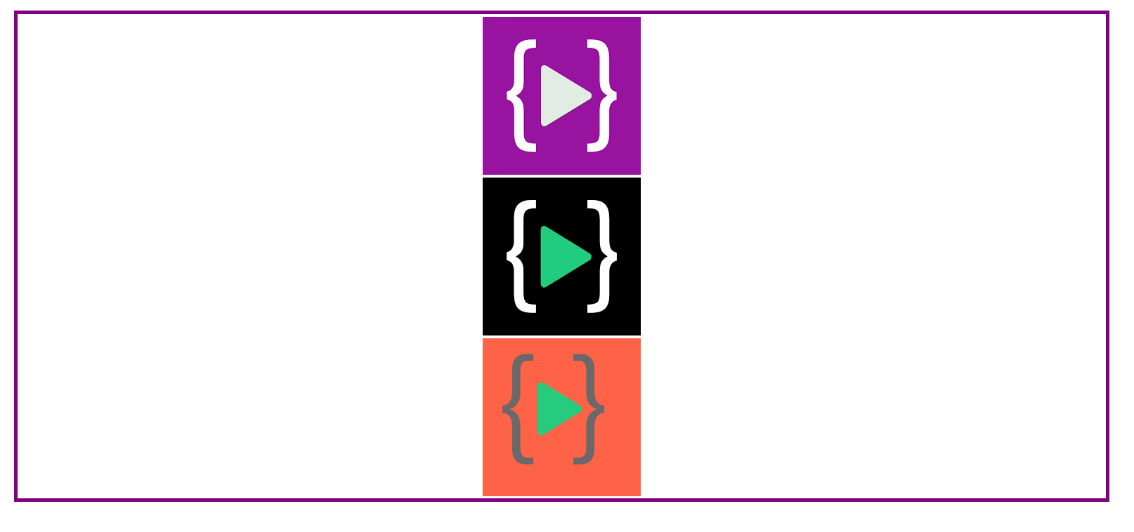
you can see all the items in the center horizontally and vertically this is all possible because of the cross-axis and main-axis.